Understanding the Data Foundation
This dashboard is powered by a relational star schema designed for performance and clarity. It consists of two types of tables: Dimension tables provide the "who, what, where, and when" context, while Fact tables contain the quantitative business measurements and transactions.
📘 Dimension Tables (Contextual Data)
1. dim_Date
| Column Name | Data Type | Description |
|---|---|---|
| DateKey | int | Unique date in YYYYMMDD format |
| FullDate | date | Full date |
| Year | int | Year component |
| Month | int | Month number (1–12) |
| MonthName | str | Full month name |
| Week | int | ISO week number |
2. dim_Products
| Column Name | Data Type | Description |
|---|---|---|
| ProductID | int | Unique identifier |
| SKU | str | Stock Keeping Unit |
| ProductName | str | Product name with brand and model |
| Brand | str | Brand name |
| Category | str | Product category |
| UnitCost | float | Unit manufacturing/wholesale cost |
3. dim_Retailers
| Column Name | Data Type | Description |
|---|---|---|
| RetailerID | int | Unique retailer ID |
| RetailerName | str | Retailer company name |
| Channel | str | Sales channel (e.g., Online, Key Account) |
| Region | str | Country/region (UAE, KSA, etc.) |
| RFM_Segment | str | Recency-Frequency-Monetary segment |
📊 Fact Tables (Transactional Data)
4. fact_Sales
| Column Name | Data Type | Description |
|---|---|---|
| TransactionID | int | Unique transaction ID |
| DateKey | int | Foreign key to dim_Date |
| ProductID | int | Foreign key to dim_Products |
| RetailerID | int | Foreign key to dim_Retailers |
| SaleType | str | "Sell-In" or "Sell-Out" |
| UnitsSold | int | Number of units sold |
| UnitPrice | float | Selling price per unit |
| TotalRevenue | float | Revenue = UnitsSold × UnitPrice |
| TotalCost | float | Cost = UnitsSold × UnitCost |
| GrossProfit | float | Profit = Revenue - Cost |
5. fact_Inventory
| Column Name | Data Type | Description |
|---|---|---|
| SnapshotDateKey | int | DateKey (end of quarter) |
| ProductID | int | Foreign key to dim_Products |
| UnitsOnHand | int | Inventory count at snapshot |
| InventoryValue | float | Value = UnitsOnHand × UnitCost |
6. fact_Marketing_Campaigns
| Column Name | Data Type | Description |
|---|---|---|
| CampaignID | int | Unique campaign ID |
| CampaignName | str | Name of the marketing campaign |
| StartDateKey | int | Start date (foreign key to dim_Date) |
| EndDateKey | int | End date (foreign key to dim_Date) |
| CampaignCost | float | Cost of running the campaign |
| AttributedRevenue | float | Revenue attributed to the campaign |
| ROI | float | Return on Investment = (Revenue - Cost)/Cost |
7. fact_JBP_Performance
| Column Name | Data Type | Description |
|---|---|---|
| JBP_ID | int | Unique Joint Business Plan ID |
| RetailerID | int | Foreign key to dim_Retailers |
| Year | int | Year of the JBP |
| TargetRevenue | float | Targeted revenue for the year |
| ActualRevenue | float | Actual revenue achieved |
🧭 Relationships (Primary Keys / Foreign Keys)
fact_Sales.DateKey,fact_Inventory.SnapshotDateKey,fact_Marketing_Campaigns.StartDateKey,fact_Marketing_Campaigns.EndDateKey→dim_Date.DateKeyfact_Sales.ProductID,fact_Inventory.ProductID→dim_Products.ProductIDfact_Sales.RetailerID,fact_JBP_Performance.RetailerID→dim_Retailers.RetailerID
Project Architecture & Workflow
To ensure a robust and scalable BI solution, the project was designed using standard UML (Unified Modeling Language) diagrams. These models provide a clear blueprint of the system's actors, structure, behavior, and deployment, facilitating cross-functional understanding and alignment.
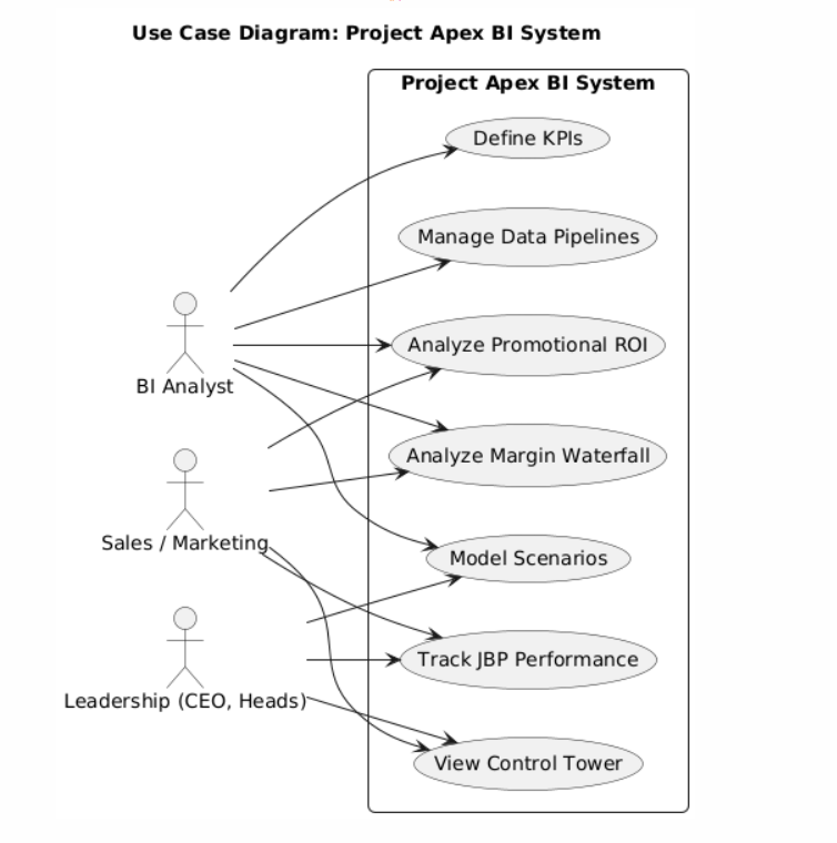
1. Use Case Diagram
This diagram illustrates the interactions between different user roles (e.g., Sales Manager, Operations Analyst) and the BI system. It defines the key functionalities each user can perform, such as 'Analyze Sales Performance' or 'Monitor Inventory Levels'.
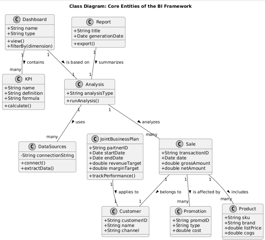
2. Class Diagram
The Class Diagram details the static structure of the data model, showing the tables (classes), their attributes (columns), and the relationships between them. It is the technical blueprint for the star schema.
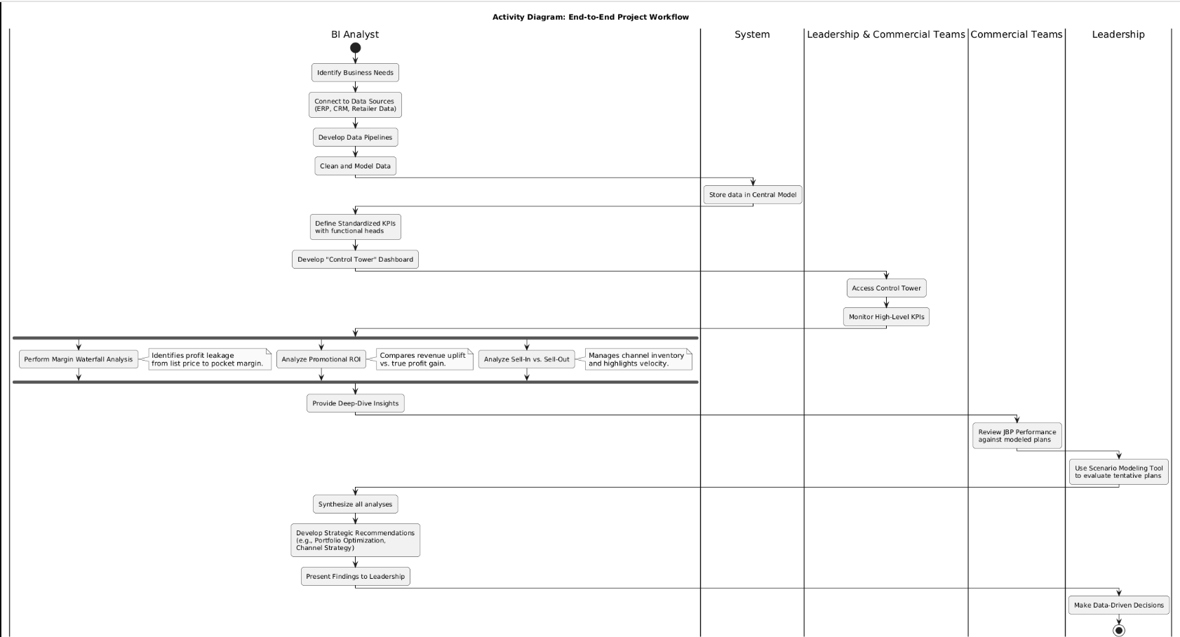
3. Activity Diagram - E2E Workflow
This diagram visualizes the end-to-end business process, from data extraction from source systems (ETL), through data modeling in Power BI, to the final report consumption by business users.
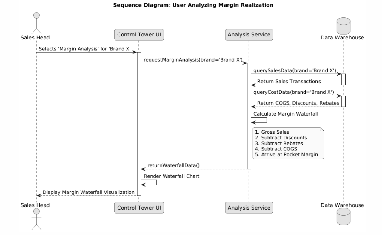
4. Sequence Diagram: Margin Analysis
This diagram shows a specific user interaction over time, detailing the calls between the user, the Power BI front-end, the DAX engine, and the data model as a user filters for a product to analyze its margin.
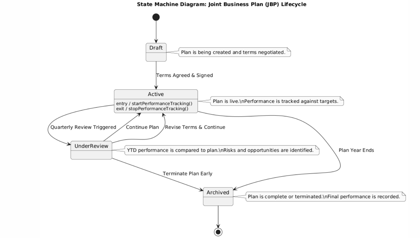
5. State Machine Diagram: JBP Lifecycle
This diagram models the different states a Joint Business Plan can be in, from 'Draft' and 'Active' to 'Underperforming' and 'Completed', and the events that trigger transitions between them.
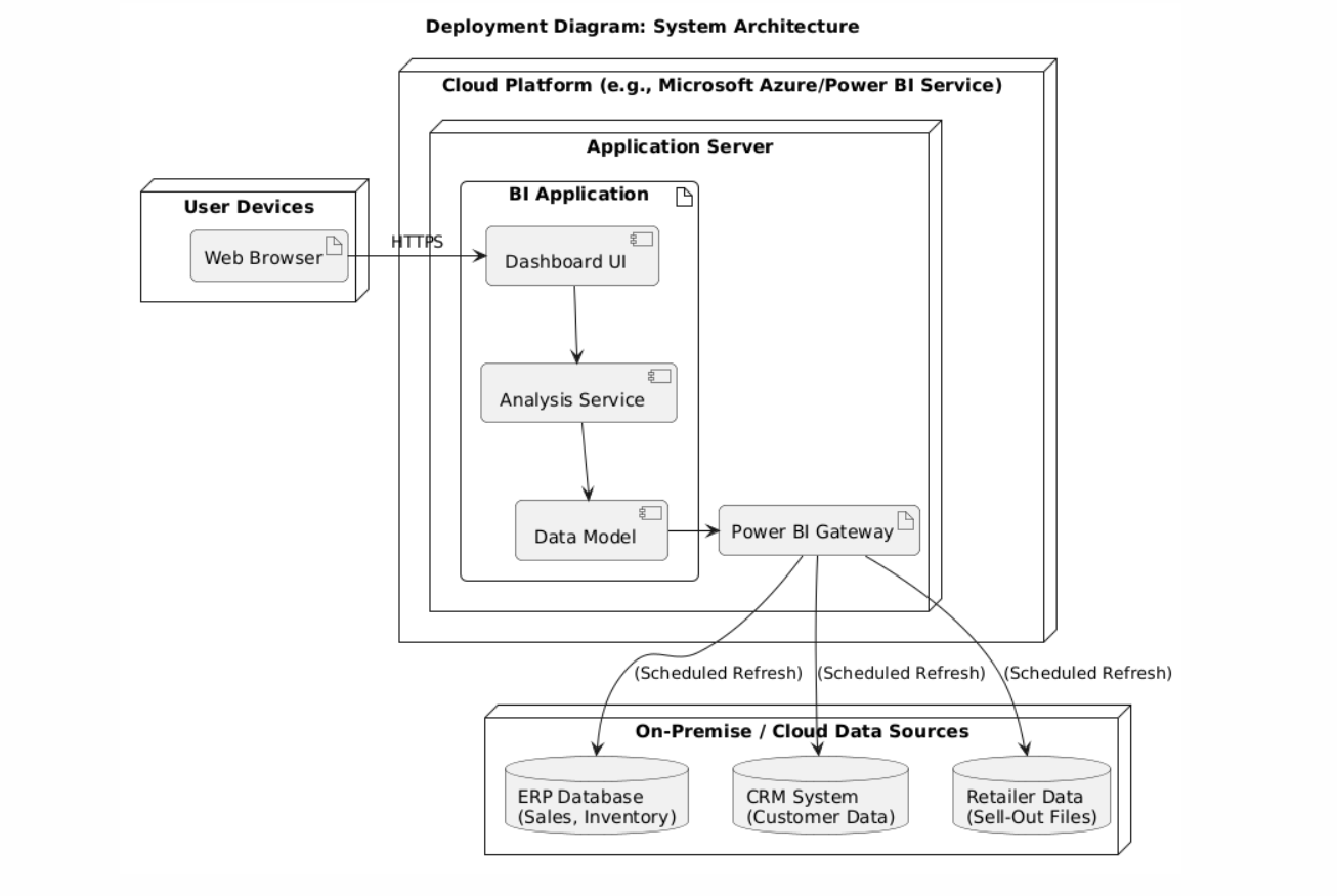
6. Deployment Diagram: Architecture
This diagram illustrates the physical deployment, showing source databases, the Power BI Gateway for data refresh, the Power BI Service, and end-user devices.